What Makes a Good Landing Page Design
For many marketers one of the most difficult things to do is design a really great landing page. This is unfortunate because the landing page is the first (and often only) opportunity to sell the visitor on whatever it is you want them to do. A great landing page can really make the difference between success and failure of any website so it is essential to take a minute and learn what makes a good landing page design.
THINKING OF THE VISITOR
When planning out a landing page design it might be tempting to start by thinking about what will get the most action from the visitors. Whether you want them to make a purchase, sign up for a list or download something, getting them to take action is important. The problem is, many designers think first about that action and not the visitor themselves. To get the best results the focus should always be on providing the visitor with a great experience so they will be comfortable on the page.
Internet users today are tired of being slammed advertisements, videos, auto and flashing images right when the page loads. While each of these things can be used, it is essential to take a step back and think about what the average visitor will think when they see your landing page. This will help avoid many of the most common mistakes web marketers make.
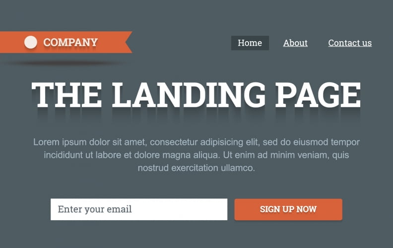
FOCUS ON ONE ACTION
Another thing that some people are tempted to do is give visitors to the landing page several different options. They may have a quick form to fill out which will opt-in for an e-mail list, and a place to download free content and sometimes even an advertisement which will bring them to another site all together. While this may seem like a good idea because it gives you three ways to make money, it is actually going to spread your efforts too thin and most potential customers will just browse away.
Think about the purpose of your landing page and focus the entire design on achieving that goal. If you want to get people to sign up for your list, for example, design the entire page around that goal. Getting people to take the action you want is far more effective when you have just one option for them available.
CALL TO ACTION
Every landing page has to have at least one call to action. This is a phrase which directly tells the visitor what it is they should be doing. It could be a big arrow with the words “Sign up Here” printed on it, or it could be a button which instructs users to download your software. Whatever it is, there has to be one and it should really stand out to the customer. There are many benefits of a call to action, and when done properly it can dramatically increase the number of visitors who take that action.
It is important to remember, however, that the specific call to action which works for one type of site might fail completely on another. Learning what types of things work in your niche is essential, and experimenting can be a great way to discover the most effective image and wording combination for your specific site.
Taking the time to plan out an excellent landing page will be well worth the effort you put into it. Many marketers have seen incredible increases in their conversion rates after adjusting their landing page to be better designed and more focused on their wants and needs.
Share on Facebook Share on Twitter Share on Pinterest
0 Comments on "What Makes a Good Landing Page Design"